Task Simple is a clutter-free task app that helps you break down work and stay focused.
Role
I was responsible for the UX research, wireframing, prototyping, and UI design for this project, ensuring a user-friendly and visually cohesive experience.
Type
A self-initiated project, Task Simple is a mobile app for iOS and Android, built to make task management effortless and intuitive.
Design Tools
I used Figma to design and build interactive prototypes.
I’ve always prided myself on staying organized and efficient, so I set out to find the perfect mobile task app that could support my busy schedule. Eager to streamline my daily activities, I explored a variety of popular mobile apps, only to run into the same frustrating issue: poor user experience. Many of these apps seemed to reinvent the wheel, cramming in extra features aimed at power users while making basic task management needlessly complicated. This overload of options didn’t enhance productivity. It buried the core functionality, making it harder to focus on what actually mattered.
After discussing with friends and colleagues, I quickly realized this wasn’t just my experience. It was a common struggle. I created an empathy map to capture their perspectives and pinpoint key pain points. Here’s some of the feedback I gathered:
"Sometimes I just need to jot something down quickly before I forget. It shouldn’t take multiple steps just to add a task."
"I don’t want to have to think about categories or labels when I add a task. I just want to write it down and move on."
“I want to be able to add my main tasks and sub-tasks in an easy way."
“Timers help me stay on track, but I don’t want to switch between apps just to use one.”
The insights were clear: people wanted a mobile task app that was simple and intuitive.
Personas: Understanding Our Users
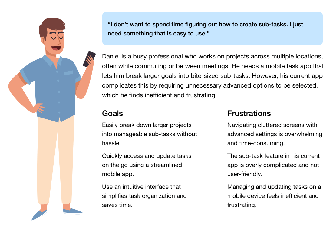
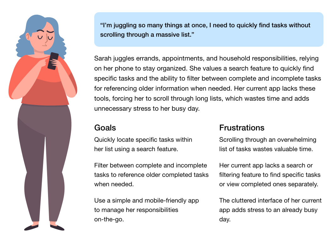
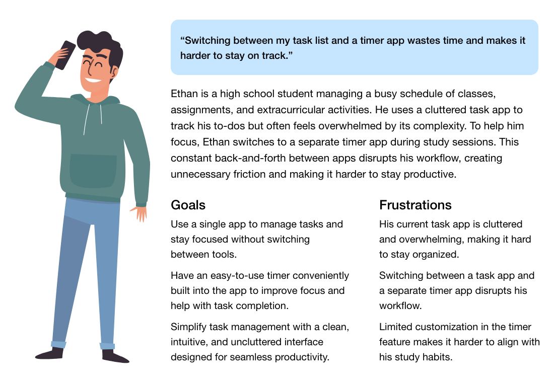
Through research, I identified three key personas with different mobile task management challenges. Some need simpler ways to break down projects, others faster ways to find tasks, and some built-in focus tools to stay productive. These personas guided design decisions.
- Daniel, the busy professional, needs quick, hassle-free sub-tasks.
- Sarah, the multitasking parent, needs search to avoid endless scrolling.
- Ethan, the student, needs a built-in timer to stay focused.
Finding the Problem Statement
After talking to friends and colleagues and digging into different task apps, one thing became clear: most of them try to do too much. Instead of making life easier, they overload users with features that only a handful of power users ever touch. The result? A cluttered, confusing experience that makes staying organized harder than it should be.
Most mobile task apps overcomplicate things by cramming in extra features, making it difficult for users to focus on the basics of staying organized and getting things done.
My goal was to design an app that focused on the essentials, helping users stay organized without unnecessary distractions. By prioritizing clarity and ease of use, I aimed to create a tool that felt intuitive from the start.
Sketching: From Ideas to Wireframes
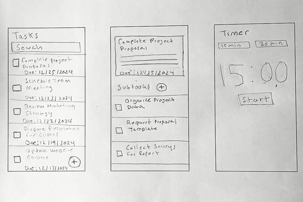
I started with hand-drawn wireframes. There’s something freeing about putting pen to paper. It lets ideas flow without overthinking. These early sketches focused on simplicity and ease of use, reflecting the needs and frustrations uncovered through the personas.
These wireframes highlighted key features:
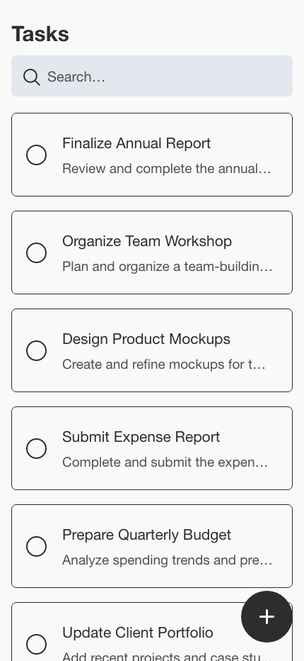
- Search: A search feature to quickly find tasks.
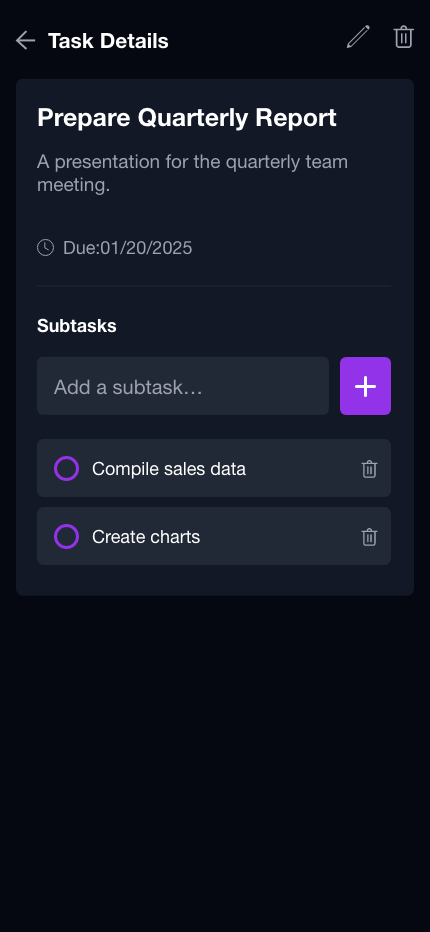
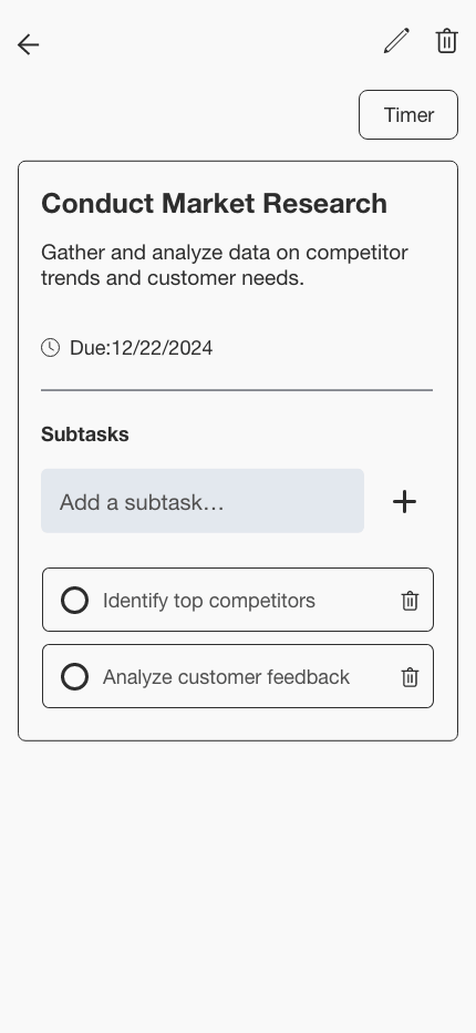
- Sub-tasks: The ability to add sub-tasks easily while on the go.
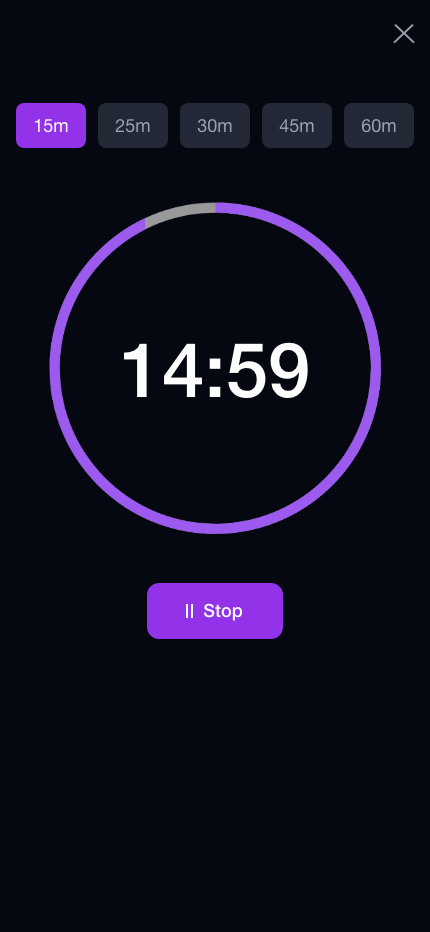
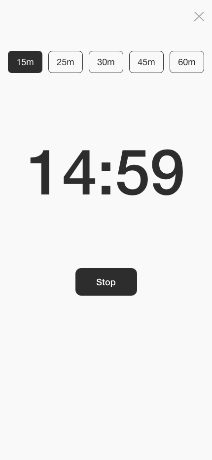
- Timer: An Integrated timer, so users can stay focused and don’t have to switch between apps.
Low-Fidelity Wireframes
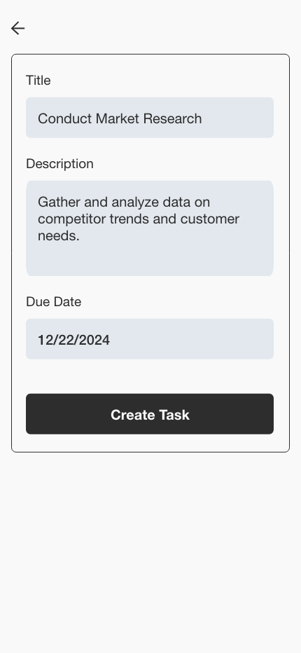
After solidifying the initial hand-drawn concepts, I transitioned to Figma to create low-fidelity wireframes. Low-fidelity wireframes enabled early testing and feedback, allowing me to refine features and usability before shifting focus to high-fidelity aesthetic design.
Interactive Prototype and User Testing
I then transformed the wireframes into an interactive prototype and conducted the first round of usability testing utilizing Usertesting.com.
Here’s what we validated through testing:
Validated Design Elements
- Search: The search functionality is intuitive for finding specific tasks within the list.
- Sub-tasks: Users found it easy to add sub-tasks.
- Plus icon button: All users immediately recognized the plus icon button as the way to add a task.
Areas for UX Improvement
- List item completion: Users were uncertain whether clicking on a list item would mark the task as complete or open it.
- Timer location: When asked to set the timer, users experienced confusion about where to locate it when starting from the main screen.
- Task list sorting: Users demonstrated a need to organize the task list by completed and incomplete tasks.
- Task due date visibility: Users wanted to see the due date for each task displayed directly on the main task list screen.
Incorporating Feedback and Round 2 of Testing
Based on user feedback from testing the initial prototype, I translated feedback into UX improvements. I then conducted a second round of user testing to validate these changes, and the feedback confirmed that the latest updates worked exceptionally well. These updates included:
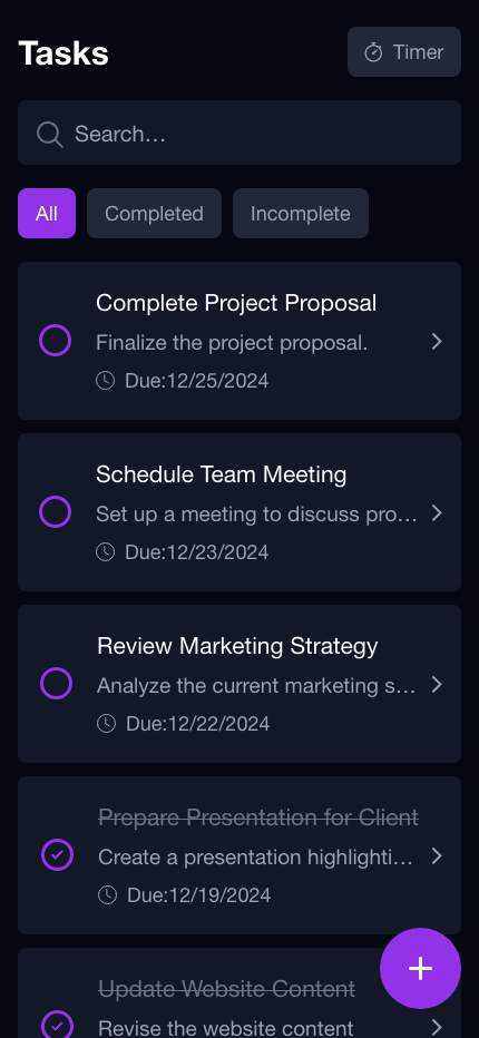
- Task filters for sorting: Adding list filtering options (All, Completed, Incomplete).
- Task due dates: Displaying due dates directly in the main task list.
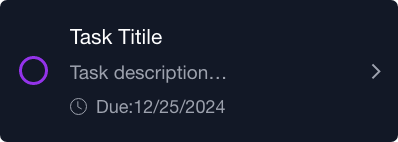
- List item interactions: Adding an arrow icon to the list item to avoid confusion between marking a task as complete and opening task details.
- Timer: Moving the timer to the upper right of the main screen for better visibility and accessibility.
Design System: Creating a Cohesive Look
Before diving into high-fidelity prototypes, I established a design system to keep everything consistent.
The design system included:
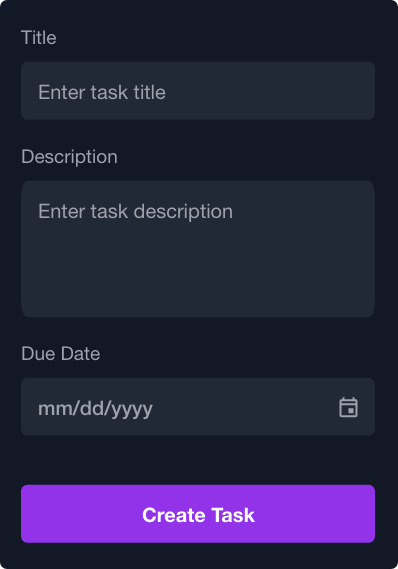
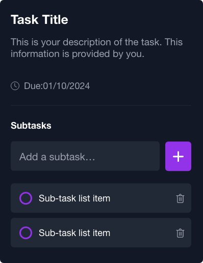
- Components: Reusable elements like list items and task cards to create a seamless experience.
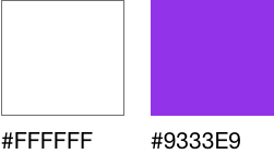
- Colors: A palette that was modern but not overwhelming, with enough contrast for accessibility.
- Typography: Clean, readable fonts that balanced style and function.
Form
Card
List Item
Sub-task List Item

Segmented Group
Primary
Secondary

High-Fidelity Prototype: Bringing It All Together
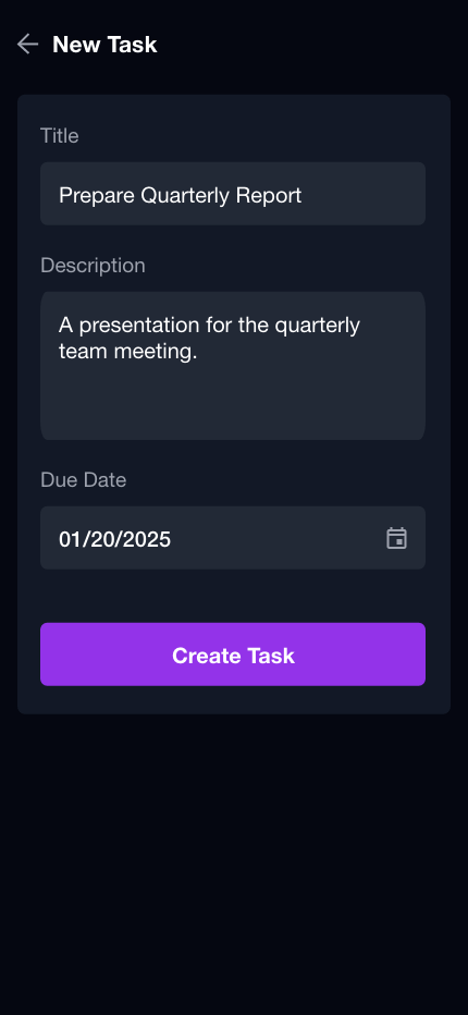
With the design system in place, I moved on to the high-fidelity prototype. This step was like breathing life into the sketches and wireframes. Everything became interactive, vibrant, and real.
Final Thoughts: A Simpler Way to Stay Organized
The app eliminates feature overload by focusing on core task management essentials, ensuring users can stay organized without unnecessary friction. Effectiveness was measured through user research, testing, and iterative design improvements. Users could easily create, organize, and complete tasks, and the app was ready to be built. With everything in place, I handed it off to our developer for implementation.